User Guide
This user guide is a comprehensive description of all of Sterling's features, and is a great place to refer back to as you're learning how to use Sterling. The first two sections introduce navigation and layout of the user interface, and subsequent sections go into the details of the various views and tools. Once you're comfortable using Sterling, you can refer to the Cheat Sheet when you need a quick refresher on keyboard shortcuts and interactivity.
Navigation
Sterling, like the Alloy visualizer, displays only a single instance at a time. There are three views which can be used to view and explore the instance data — graph, table, and source. The graph and table views display the instance data and provide settings and tools that allow you to manipulate how that data is presented. The source view displays the model source code used to generate the current instance.

The navigation bar along the top of the display provides three buttons that allow you to switch between the three views. The G, T, and S keys can also be used to toggle between the graph, tree, and source views respectively. Click the Next button at the right hand side of the navigation bar to request the next solution from Alloy. The command used to generate the current instance is displayed to the left of the Next button.
UI Layout
Below the navigation bar, the Sterling user interface is split into three sections. On the left edge of the display is the sidebar, which allows you to access various tools that will be displayed in the drawer to the right of the sidebar. Clicking on a sidebar button will open the drawer to display a tool, and clicking it again will close the drawer. The main portion of the display, called the stage, is to the right of the drawer and displays the instance data.
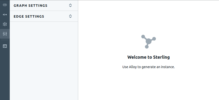
A unique set of tools is provided for each view, and as you toggle between views you'll see the buttons in the sidebar change to reflect the tools available. The buttons above the divider are unique to the currently selected view, while the buttons below the divider are available in all views. You can learn more about the globally available tools in the Tools section.
Graph View
The graph view displays the current instance as a directed graph in which nodes represent atoms and edges represent the relations between atoms as defined by fields.
There are four tools available in the graph view, each accessible through sidebar buttons as outlined in the following table. An in-depth description of each tool is provided in the next four sections, followed by a list of keyboard shortcuts and interactivity.
| Sidebar Button | Description |
|---|---|
 |
Projections and Node Styling |
 |
Edge Styling |
 |
Layout |
 |
Graph Settings |
Projections and Node Styling
The Projections and Node Styling tools are used to control the visibility and styling of graph nodes. Projecting over an Alloy signature allows you to view the graph from the perspective of specific graph nodes, and is often useful when viewing models that include state change.
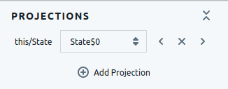
The Projections section contains a list of currently active projections, each row showing the signature, the currently projected atom of that signature, and a set of controls. Click on the current atom to select from a list of all atoms in the signature, or click the left and right buttons to step back and forth through the atoms. Click on the X button to remove the projection.
Use the Add Projection button to add new projections.
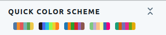
The Quick Color Scheme section contains buttons that can be used to apply a preset color scheme to the complete set of nodes.
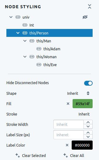
The top half of the Node Styling section shows the signature tree of the current instance. Click on a signature to display the styling options for that signature in the bottom half of the section. The eye button next to the univ signature can be used to toggle visibility in the tree of signatures that contain no atoms.
The bottom half of the section shows styling options for the currently selected signature. The Hide Disconnected Nodes toggle can be used to toggle visibility of nodes that are not part of any relation.
All styling attributes that are not explicitly set for a signature will be inherited from that signature's parent.
Use the Clear Selected button to clear styling of the currently selected signature, and use Clear All to clear styling for all signatures.
Edge Styling
The Edge Styling tools are used to control the visibility and styling of graph edges, which represent the relations in the current instance.
The Quick Color Scheme section contains buttons that can be used to apply a preset color scheme to the complete set of edges.
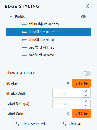
The top half of the Edge Styling section shows the list of fields in the current instance. Click on a field to display the styling options for that field in the bottom half of the section. The eye button next to the Fields label can be used to toggle visibility in the list with no tuples.
The bottom half of the section shows styling options for the currently selected field. The Show As Attribute toggle can be used to display a field as a label of the first atom of every tuple of the relation rather than as edges in the graph.
All styling attributes that are not explicitly set for a field will be inherited from the default field styles.
Use the Clear Selected button to clear styling of the currently selected field, and use Clear All to clear styling for all fields.
Layout
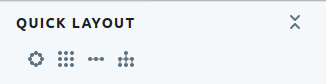
The Quick Layout section contains four buttons that can be used to quickly apply nodal layouts using sane default settings.
| Button | Description |
|---|---|
 |
Circle Layout — arrange nodes in a circle that fits the current zoom level |
 |
Grid Layout — arrange nodes in a grid that approximately fits the current zoom level |
 |
Row layout — arrange nodes in rows, grouping according to signature |
 |
Layered layout — arrange nodes in a Sugiyama-style graph layout |
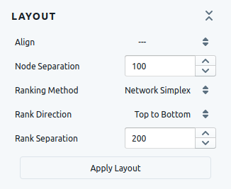
The Layout section allows you to adjust the settings for a Sugiyama-style graph layout. After adjusting the settings, click the Apply Layout button to apply the layout to the graph. This particular layout algorithm comes from the Dagre library.
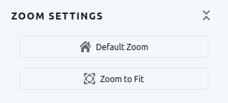
The Zoom Settings section includes two buttons to help in adjust the zoom to useful levels. Use the Default Zoom button, or press H, to return to the default zoom level. At the default zoom level, the stage is centered on coordinates (0, 0) and the visible extent of the x- and y-axes are equal to the width and height of the viewport in pixels. Use the Zoom to Fit button, or press F, to adjust the zoom level so that all nodes fit in the viewport.
Graph Settings
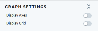
The Graph Settings section includes general settings that control how the graph is rendered. Use the Display Axes toggle, or press Shift + A, to toggle the visibility of the axes. Use the Display Grid toggle, or press Shift + G, to toggle the visibility of the grid.
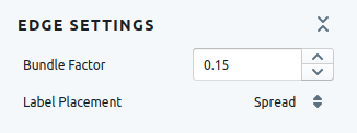
The Edge Settings section provides settings that control how edges are rendered. The Bundle Factor controls the curvature of edges when there are multiple edges between two nodes. Higher values will fan out the edges while lower values will bring them closer.
When multiple tuples of a field begin and end at the same atom, the labels for those tuples are all placed on the same graph edge rather than drawing an edge for each one individually. The Label Placement setting controls how multiple labels are arranged along an edge.
| Option | Description |
|---|---|
| Center | Places all labels at the center of the edge |
| Join | Combine all labels into a single, comma separated label |
| Spread | Evenly spread the labels along the length of the edge |
Keyboard Shortcuts and Gestures
The following table contains a list of keyboard shortcuts and gestures that can be used when the graph view is active.
| Keyboard Shortcut | Action |
|---|---|
| F | Zoom to fit graph |
| H | Return to home (default zoom) |
| Shift + A | Toggle axis visibility |
| Shift + G | Toggle grid visibility |
| Gesture | Action |
|---|---|
| Click + Drag background | Pan |
| Click + Drag node | Reposition Node |
| Scroll | Zoom |
| Double-Click | Zoom In |
| Shift + Double-Click | Zoom Out |
| Hover graph edge | Hide all other edge labels, dim all edges not part of same relation |
Table View
The table view displays the current instance as a collection of tables. Table types include signatures, fields, and skolemized variables. Skolemized variables can optionally be viewed as highlighted rows in the signature or fields tables.
The table view only contains a single sidebar tool which provides general settings, as described in the following three sections.
| Button | Description |
|---|---|
|
Table Settings |
Tables
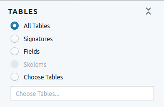
The Tables section allows you to choose the set of visible tables by category or by selecting individual tables. The skolems option will be available if the option to display skolems as highlighted rows is disabled. Click on the Choose Tables text field to display a list of tables to choose from, and begin typing to narrow the list using predictive search.
Data Options
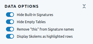
The Data Options section provides a number of toggles to adjust the visibility of certain tables and table attributes. With Display Skolems as highlighted rows active, skolem tables will not be visible and rows of the signature and field tables will be highlighted accordingly.
Layout Options
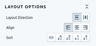
The Layout Options section provides buttons that can be used to adjust the layout and alignment of the tables on the stage.
| Button | Description |
|---|---|
 |
Layout in rows |
 |
Layout in columns |
 |
Left align |
 |
Center align |
 |
Right align |
 |
Group by type (signature, field, or skolem) |
 |
Sort alphabetically descending by table name |
 |
Sort alphabetically ascending by table name |
 |
Sort numerically descending by number of rows |
 |
Sort numerically ascending by number of rows |
Source View
The source view displays the Alloy model that was used to generate the current instance, including all imported modules.
The sidebar button in the source view shows the complete list of files that comprise the model.
| Button | Description |
|---|---|
 |
Model Sources |
Model Sources
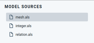
The Model Sources section shows a list of all Alloy modules used to generate the current instance. The currently selected file is displayed in the main view. Note that these source files cannot be edited in Sterling, and are for reference only.
Tools
Tools below the divider in the sidebar are accessible from all views. Currently the only globally accessible tool is the evaluator.
| Button | Description |
|---|---|
 |
Evaluator |
Evaluator
The Evaluator is used to evaluate expressions, allowing you to type in Alloy expressions and see their values. For example, typing univ shows the set of all atoms. The evaluator consists of a toolbar that contains two tool buttons, a results pane that contains the results of all evaluated expressions, and the evaluator text area to type in expressions. All three are described below.
Toolbar
The toolbar contains two buttons:
| Button | Description |
|---|---|
 |
Clear the results pane and all history |
 |
Display results as tables instead of text. Clicking again will toggle the results back to text. |
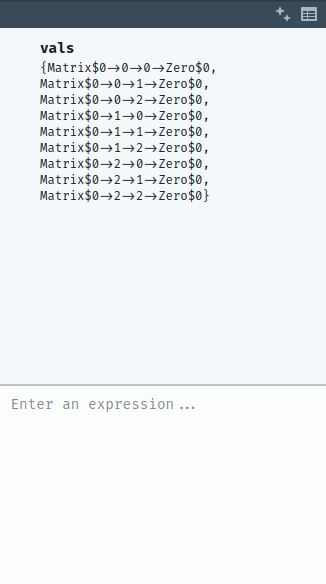
Results
The results pane includes the evaluated results of all expressions. As seen in the image, the expression is in bold text above the value of that expression. The value is displayed as text by default, but can be displayed as a table by clicking the table icon in the toolbar.
Evaluator
Type expressions into the evaluator and press enter to calculate the result. Use the ↑ and ↓ arrow keys to recall old inputs.